Wednesday, November 02, 2005


Friday, October 28, 2005
Monday, October 17, 2005
Potter, Potter, Potter
Potter, Potter, Potter, Potter, Potter, Potter... A Snape, A Snape, A Snape... (I very much like the sampling of the HP theme...)
But is it useful? And I quoteth myself from a short essay I wrote for my digital studies class: "To recall McGann, new media studies must embrace play to survive, to thrive. Digital studies is serious, but it cannot be too serious. Digital studies is about experimentation and entertainment, but it is also about evidence, history, technology, and education. It is no wonder that my graduate class on digital studies exhorted play and the investigation, close reading, earnest analysis, and further creation of “toys” -- both analog and digital, both scholarly and popular, both useful and playful. In a manner, then, even a seemingly frivolous site like www.badgerbadgerbadger.com can be illuminating, if not important. The badgers are algorithmic, rhythmic, iterative, illustrative, mathematical, communicative, evocative, narrative, and colorful; though linear (though the syncing of the sound and image does begin to slip creating a new text) and not playable, the badgers are definitely playful and intertextual and meaningful (badger as metaphor, folklore of the mushroom, and symbology of the snake). With a little time, the right technology, and imagination, the rolling loop and various pieces of the flash animation can be taken apart, reconfigured, exported, imported, and reassembled into a new digital text. In fact, the bouncing badgers have spawned a number of other texts. It is this transportability, this modularity, this encouraging borrowing and reimagining that is the heart and spirit of new media. It is the reason texts are made, made again, and studied. It is the heart and spirit of play."
But is it useful? And I quoteth myself from a short essay I wrote for my digital studies class: "To recall McGann, new media studies must embrace play to survive, to thrive. Digital studies is serious, but it cannot be too serious. Digital studies is about experimentation and entertainment, but it is also about evidence, history, technology, and education. It is no wonder that my graduate class on digital studies exhorted play and the investigation, close reading, earnest analysis, and further creation of “toys” -- both analog and digital, both scholarly and popular, both useful and playful. In a manner, then, even a seemingly frivolous site like www.badgerbadgerbadger.com can be illuminating, if not important. The badgers are algorithmic, rhythmic, iterative, illustrative, mathematical, communicative, evocative, narrative, and colorful; though linear (though the syncing of the sound and image does begin to slip creating a new text) and not playable, the badgers are definitely playful and intertextual and meaningful (badger as metaphor, folklore of the mushroom, and symbology of the snake). With a little time, the right technology, and imagination, the rolling loop and various pieces of the flash animation can be taken apart, reconfigured, exported, imported, and reassembled into a new digital text. In fact, the bouncing badgers have spawned a number of other texts. It is this transportability, this modularity, this encouraging borrowing and reimagining that is the heart and spirit of new media. It is the reason texts are made, made again, and studied. It is the heart and spirit of play."
Thursday, September 01, 2005
Media Bias At Work
Thanks to the notice of my friend Drew, here below is a startling example of media bias and the racist project of whiteness at work. In the aftermath of Hurricane Katrina, the anarchy of those areas hardest hit is shocking, poignant, and at times dystopic. It only goes to show how little it takes to reduce our "first" world to a "developing" world. Not the language used in the captions for each photo.
The first image, in a long "slideshow" of images, is of two people -- importantly caucasian -- who have managed to "find" supplies from a local mart http://news.yahoo.com/photo/050830/photos_ts_afp/050830071810_shxwaoma_photo1:
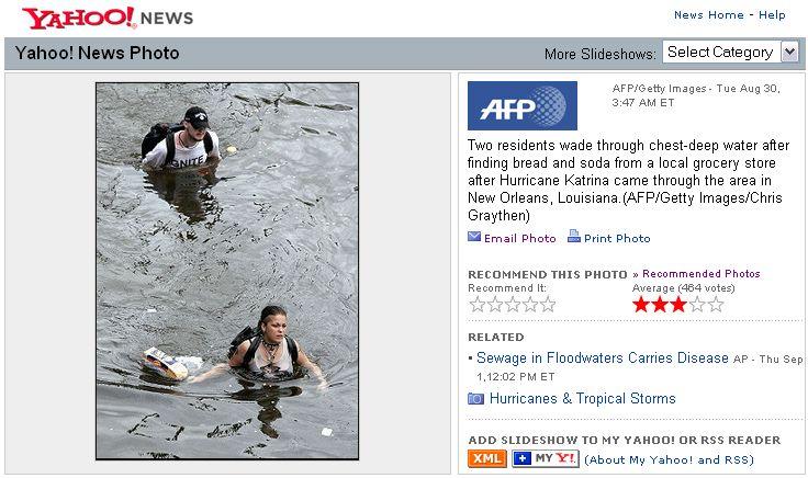
The second image is of a single black (or dark-skinned) male who has "looted" supplies from a local mart http://news.yahoo.com/photo/050830/480/ladm10208301530:

Two distinct verbs used to describe what tantamounts to the same action. However, one is characterized as positive, perhaps even noble, as the people shown in the image have the American pluck to survive. Whereas, the second is characterized as negative, perhaps dangerous, as the young black man is living up to the longstanding prejudice and stigma of criminality. It can be argued -- and critics like George Lipsitz have been arguing -- that whiteness continues to find ways and preserve means to shore up its power, its privilege. Here, the white people in the first photo have a right to the goods they have "found"; in a deep sense, whiteness must and should and by all means justly survive. On the other hand, the black young man in the second photo has won his survival by ill gotten means. This is the narrative that has been fed into the media, into the history, and into the dominant ideology for many, many years.
Wednesday, August 10, 2005

Monday, August 08, 2005
Amaztype: Representating Texts/Searches
It is amazing how often I find something online by sheer happenstance. A click here leads me here, a click there lead me someplace else. Though not strictly a narrative experience (though some might argue that 'surfing' does in fact create story), my hypertexting through, across, in and out of various interconnected websites does lead me on a journey. Most recently, my journey to 'the most advanced digital clock ever' (see last post) led me to a web designer's site, which serves as a kind of online portfolio. One of the designer's works is a project for www.amazon.com called amaztype.
amaztype is a search engine that allows you to look for a word or phrase in the titles or authors of books, music, or videos. amaztype then begins to generate thumbnails (of varying size) of all the things that contain the keyword or keyphrase. All of the images are drawn from Amazon's website. The clever and fascinating thing is that the thumbnails begin to slowly pile-up one on top of another and eventually form the very word or phrase searched for. For example, I typed the keyword "laser" and all of the titles with that word came up to form the letters L-A-S-E-R.
The amazing thing (imagine that) is that all of the thumbnails can be clicked on. Clicking on a title zooms in the camera view. Then pertinent data about the item, such as full title (with keyword in red), author, price, sales rank, and user rating, come up. You can then choose to get more information and a new browser window opens to the item's www.amazon.com page. While zoomed in, you can click through the pile of items. It isn't a sorted search. It invites exploration, the turning over of stones. In a way, the experience is like looking through a bin of books or CDs or video tapes. (Again, a kind of unstructured journey and narrative -- like web surfing.)
The project is enticing, exciting as you watch more and more thumbnails pile up and pile up. amaztype reminds me of the work done at www.textarc.org, which the site describes as: "A TextArc is a visual represention of a text—the entire text (twice!) on a single page. A funny combination of an index, concordance, and summary; it uses the viewer's eye to help uncover meaning." In a way, amaztype allows the user to visualize their search, to understand the immensity of their search (literally showing a huge, overlapping pile of items), and to create a virtual (pseudo-virtual) experience much like browsing or rummaging.
Furthermore, the site provides a "new" feature called amaztype zeitgest, which generates the top ten keywords users have entered for the various search categories. There is definitely an emergent narrative in those lists.
I'm sure there's more to say about it (once I do a little follow-up reading and research). For now, it's still darn neat. Go play!
Sunday, August 07, 2005
Time: Is it digital? Or is it analog?
While making may way through my usual haunts online, I came across a LiveJournal entry touting "the most advanced digital clock ever!" I was intrigued and took a look at the link: http://www.lares.dti.ne.jp/%7Eyugo/storage/monocrafts_ver3/03/index.html, which takes to you a page designed by Yugo Nakamura. (Some of the web design and digital experiments are quite interesting, in particular Selection #5: Amaztype.)
The link above takes you to the "Industrious 2001" page with an animated real-time clock where the letters and numerals are images of handwritten letters and numerals in thick pencil. As the seconds, minutes, hours, and date (though I did not sit and wait to watch the day change) changes with an animation of the letter or number being hastily erased and the successive character written in its place. It is black-and-white and decidedly mesmerizing.
I'm not sure how to think through the project. It's definitely high on the 'neat' scale. But there is a curious comment here on the juxtaposition of the digital and the analog, the virtual and the physical. It's on the tip of my tongue, at the tips of my typing fingers. On a gut level, the clock is nostalgic for me. Very few of us now really work with pencil and paper anymore (much less an actual wooden pencil rather than a mechanical one). The scratch of the HB lead on paper is a happy sound for me. The clock reminds me of all of these things.
More soon.
Friday, July 15, 2005
Do You Yahoo!?
It seems that Yahoo! has forgotten about the Abercrombie & Fitch scandal that broke about three years or so ago with their 'humorous' t-shirts that read, "Two Wongs Can Make It White," and featured slanty-eyed men doing laundry. See http://www.clta-gny.org/news-interest-7.htm.

As I was idly checking my email today, a flash animation ad on the Yahoo! mail site came up big and bold and red. In the animation, an obviously Asian woman (with her slim retro capri pants, black bobbed and barretted hair, little slippers, and slanted eyes; even the red color palette is vaguely Asian) groaning under the weight of freshly dry cleaned clothes walks out of a shop. She leaves the frame of the ad dropping a dress on the ground. Then the ad hocks Yahoo! HotJobs, where ostensibly this struggling woman can find a less strenuous and more fulfilling line of work. So, what do we do with this image? This stereotype? This covert racism?


Both the t-shirt and the Yahoo! ad remind of Dwight A. McBride's book Why I Hate Abercrombie & Fitch and his work on unpacking the strange bedfellows of capitalism, commercialism, whiteness, race, and sexuality. In a deep sense, looking at (really looking at) and critiquing and unknotting what may seem innocent or innocuous or humorous (but in startling actuality is fraught with prejudice) is necessary work. How does the Yahoo! ad talk about race or class or gender or citizenship as whole? McBride says, "While the dominant rhetoric of our national identity presents a color-blind, 'united we stand,' Horatio Alger narrative of upward mobility, in reality, citizenship is raced, gendered, and classed, and the original texts that define citizenship and national identity in the United States reflect this reality" (68).
So, what do we do with the above image? A quick Google search turns up no response or reaction to it. I have yet to see the advertisement again. Maybe it got pulled. Maybe I haven't been fortunate enough to witness it another time. However, I do think there is something going on, something nefarious in kitschy, cute, bubblegum pink, 'humorous' clothing. What made the advert makers choose an Asian woman? Dry cleaning? Red? Separately, these details seem arbitrary. But together they add up to years of stereotyping, assumptions, and racialized (even racist) representation of Asians.
The irony here, of course, is that Yahoo! is one of the major employers of the San Francisco Bay Area/Silicon Valley, which I would guess employs a great number of Asians. You would think they would be a little more aware of their own constituents (or maybe it's one big inside joke that just isn't funny).
An Exercise in Narcissism
It seems that fashion (to be followed suit by form and function) demands that all 'serious' scholarship requires a space both on- and off-line for the exploration, publishing, or perusal of ideas, materials, questions, resources, and whatever bits and jots come to mind. As a starting PhD student in English at the University of Washington, I figure I better get with the fashion or be left on the side of the digital highway. Queer View Mirror is my attempt at a scholarly web log where I will wax (and wane) about the things that interest me, that go bump in the night in my brain and heart, that stop me and make me go "hmm." QVM is place where my indisciplinariness can shine and where I can natter on about digital studies, gender studies, race studies, pop culture, film, teaching, writing, reading, and all things intersecting and intertextual.
Subscribe to:
Posts (Atom)
